
Mobile App Mapping: Screens, States, User Flows & Variants in Production
See your production app as a connected map of screens, states, and flows.
 By Simra Sadaf · Content Writer25 sections
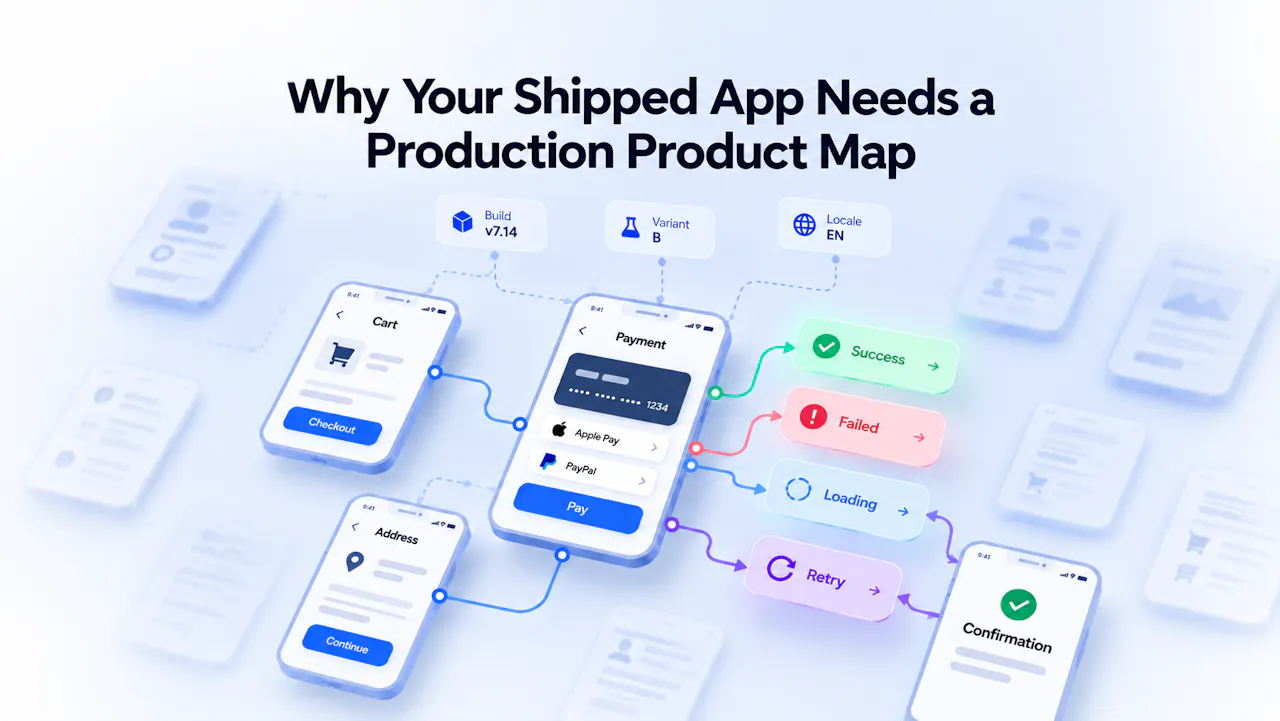
Why Your Shipped App Needs a Production Product Map
Your app already has plenty of documentation. Figma shows the app design. The codebase shows what the application can render. Analytics shows what has been instrumented. QA documents what was expected to work. Session replay shows what users encountered in individual sessions.
Each source is useful. The problem starts when you need to answer a different question: What actually exists in the app right now, and how does it all connect?
A mobile app map can provide that missing structure. Instead of listing screens in isolation, it connects app screens, screen states, actions, transitions, and user journeys across the production environment.
That's the problem Tugboat Manifest is built to address.
Why Does a Shipped Product Need a Runtime Map?
An app changes after it ships. Features gain new states, navigation changes, experiments introduce alternate experiences, releases modify existing behavior, and users reach the same part of the product through different entry points. The documentation does not always change at the same pace.
An app design layout may show the intended experience. QA may document the scenarios the team expects to work. Analytics may show which events have been instrumented. A session replay may show what happened during one user's session. None of these gives the team a complete view of the existing product and its connected runtime structure.
This is where representation drift appears. The production product changes while its design, documentation, tests, and instrumentation change at different speeds.
Source | What it represents |
Figma | What was designed |
Code | What can render |
Specs and QA | What was expected or tested |
Analytics | What was instrumented |
Session replay | What a user encountered |
Production product map | How the product connects at runtime |
A basic screen inventory has the same limitation. It might tell you that an app contains a Cart, Address, Payment, and Confirmation screen. It does not tell you what states those screens can have, which actions are available, or how users move between them. A useful mobile app map needs to show those relationships.
What Is a Product Map?
A production product map is a connected representation of the screens, states, actions, and transitions in a running product. It can organize those elements into user flows and journeys while accounting for production differences such as builds, variants, and locales.
The basic model is:
State → Action → Transition → State
For example:
Payment Failed → Retry → Loading
The transition does not have to take the user to another screen. In this case, Retry changes the Payment screen from a failed state to a loading state. That distinction matters when mapping an existing product because two identical screens can behave differently depending on their current state.
Think of a Product Map Like Google Maps for Your App
A production product map works much like Google Maps, but for an existing application. Instead of places and roads, it maps screens, states, components, journeys, and runtime behavior.
Google Maps | Production product map |
Search place | Search screen/state/component |
Ask Maps | Ask Tugboat |
Restaurants / Hotels | Changed / Shared / Gaps |
Directions | Journey / path |
Along route | “On this journey” |
Nearby | Related/shared product objects |
Layers | Builds / variants / locales |
Place details | Right inspector |
Traffic | Runtime behavior |
Route alternatives | Variant / branch paths |
You can search for a screen, state, or component, follow a journey or path, find related product objects, and see how builds, variants, and locales affect the experience.
Like Google Maps shows alternate routes, a product map can show different paths based on account state, permissions, configuration, or experiments. This gives teams a clearer view of the runtime behavior of the product instead of relying only on screens or screenshots.
A Screen Is Not a State. A Flow Is Not a Product Map.
One of the easiest ways to make an app map misleading is to treat every mobile app screen as a single state.
Consider Checkout. The same screen might appear when the cart is empty, after products have been added, after a promotion has been applied, while payment is processing, or after payment has failed.
For example:
Checkout: Empty · Populated · Promo Applied · Payment Loading · Payment Failed · Payment Complete
The interface may look similar across several of these states, but the available actions and product behavior can be very different.
The same applies to app behavior. A user may see a loading indicator, retry button, permission request, error message, or confirmation without leaving the current screen.
A production map should therefore distinguish between:
- Screens: The visible parts of the application.
- States: The conditions in which those screens can exist.
- Actions: What the user can do.
- Transitions: How the application responds to those actions.
This is also where UI and UX become relevant. UI describes what users see and interact with, while UX covers the broader experience as they move through the product. A production map connects those interface states and interactions to the actual paths available in the shipped app.
RELATED READING: How to Detect a Product Regression Before Your KPI Moves
Mobile App Design Shows Intent. Production Mapping Shows What Shipped.
Mobile app design is an important part of product development. Design teams use screens, components, screenshots, prototypes, and design systems to communicate how an experience should work. A typical app design layout might show:
Cart → Address → Payment → Confirmation
That gives product teams, designers, and engineers a clear picture of the intended experience. The same is true of app mobile design work more broadly.
Designers can define the visual hierarchy, interaction design, components, and user flows before an experience reaches production. But the shipped product can contain more than the original design.
The Cart screen may have empty and populated states. Address may have valid, invalid, and permission-blocked states. Payment may include loading, verification, failure, retry, and completion states.
The difference is important because mobile app examples and design references usually show selected experiences. A production product map needs to account for the states and paths users can actually encounter.
A Worked Example: Mapping Checkout in Production
Checkout makes the difference between design intent and production reality easy to see. A simple design flow might look like this:
Cart → Address → Payment → Confirmation
In production, it could look more like:
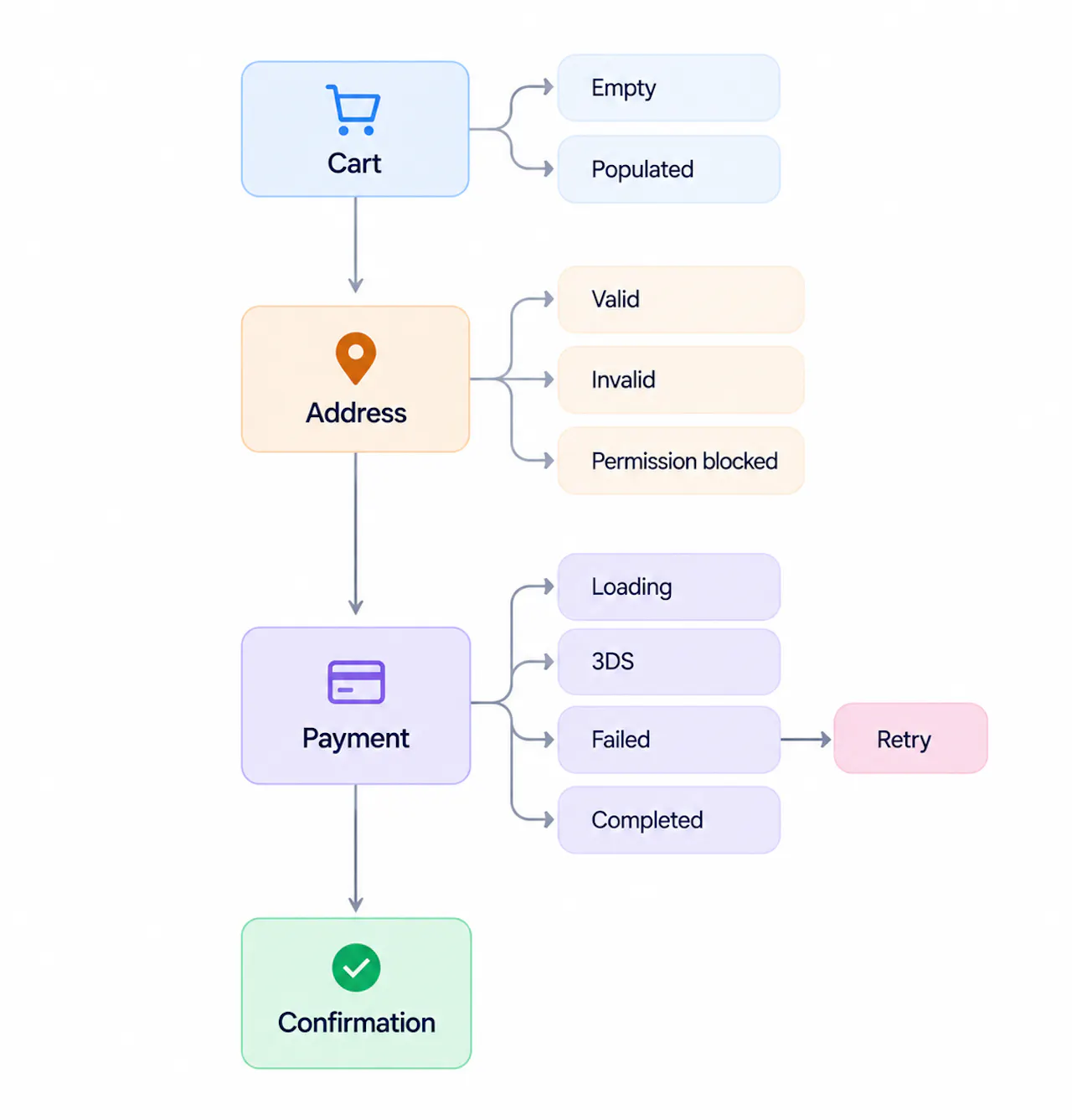
Now add production variation. An experiment might expose PayPal. A newer build might introduce a verification state. A deep link might send a user directly to Payment.
Variant B → PayPal v7.14 → Verification state Deep link → Payment
The original design still has a purpose. It documents the intended checkout experience. The production map answers a different question: what states, transitions, entry points, and variations exist in the product users can encounter?
Production Map Has to Show Its Blind Spots
A runtime map should not imply that everything theoretically possible in an application has been proven to exist. Some states may sit behind feature flags, require a particular account or permission, depend on a server response, or be so rare that they have not yet been reached.
That means a useful production map needs more than nodes and edges. It needs to make its coverage and provenance clear: where a state came from, which build or variant it belongs to, when it was last observed or represented, and what remains unexplored.
For example:
Product state | Coverage context |
Payment Failed | Observed in production · v7.14 |
Verification | Discovered during build exploration · Variant B |
Legacy Checkout | Last observed 83 days ago |
Premium Upgrade | Auth required · exploration incomplete |
The point isn't to make every map perfectly complete. It is to make its limits visible. A production map is only as trustworthy as its coverage and provenance.
This also changes how teams should interpret the map. A state that has not been observed or otherwise established by the mapping process should not automatically be treated as part of the known production structure simply because the code could theoretically produce it.
What Should a Production App Map Include?
A useful production app map needs more than a list of screens. It should show the structure that connects the application's interface, behavior, and journeys.
1. Screens and App Screens
Screens provide the visible structure of the application. A map can show how users reach each screen, what states it can take, what actions are available, and where those actions lead.
For example, a Payment screen might be reached from Checkout, an account-upgrade journey, or a deep link. An app home page can also be an important entry point. From there, users may reach several different features, each with its own screens and states.
2. Screen States
States describe the conditions in which a screen or feature can exist. Common examples include:
- Loading
- Empty
- Populated
- Error
- Permission-gated
- Processing
- Completed
- Experiment-specific
A failed payment and a successful payment may use the same mobile app screen while presenting different actions and information.
3. Actions and Transitions
Actions describe what users do. Transitions describe how the application responds. An interaction can change a state, navigate to another screen, or do both.
Payment Failed → Retry → Payment Loading
This tells you more than the existence of two screens. It shows the relationship between their states and the action connecting them.
4. User Flows and Screen Flows
Connected transitions form user flows and screen flows through the application. A user might move from the app home page to a product listing, then to a product detail screen and finally to Checkout. Another user might enter Checkout through a deep link.
These paths can overlap. Multiple user journeys can share the same screens, states, and transitions. A production product map represents those overlaps instead of treating every user flow as a separate diagram.
5. Product and App Structure
A map also gives teams a clearer view of app structure and product structure. An app may contain dozens or hundreds of screens, but a flat list does not explain how they relate. A connected map can show which screens belong to particular journeys, where users enter those journeys, and which states or transitions are shared.
This provides useful product context when teams need to understand an existing product rather than a new feature in isolation.
6. Production Dimensions
A production application can differ across build, variant, and locale.
- Build: The version of the application that shipped.
- Variant: An experiment or configured experience.
- Locale: The localized experience being presented.
A variant might change the Payment experience. A new build might introduce a verification state. A locale might change the payment options shown. These differences are part of the production product and can affect its product experience.
RELATED READING: User Behavior Analytics: 12 Patterns Hidden Between Product Events | Tugboat
Product Map vs. Sitemap, User Flow, Architecture Diagram, and Session Replay
Several tools already describe parts of a product. They answer different questions.
Capability | Sitemap | User flow | Architecture diagram | Session replay | Production product map |
Product hierarchy | ✓ | Partial | Technical | No | ✓ |
App screens | ✓ | ✓ | Sometimes | Observed | ✓ |
Screen states | Limited | Some | Sometimes | Observed | ✓ |
Actions/transitions | Limited | ✓ | Technical | Observed | ✓ |
Multiple overlapping journeys | Limited | Scoped | Technical | One session | ✓ |
Build/variant/locale context | Rarely | Rarely | Sometimes | Observed | ✓ |
Connected runtime structure | No | Scoped | Technical architecture | One observed path | ✓ |
Individual user behavior | No | No | No | ✓ | Only when behavior is overlaid |
A sitemap focuses on hierarchy and navigation. A user flow focuses on a defined journey. An architecture diagram describes technical components and their relationships. Session replay shows what happened during an individual user's session.
A production product map connects the screens, states, actions, and transitions that make up the running product. That does not make it a replacement for the other representations.
Figma remains useful for design intent. A design system remains useful for defining reusable components. Analytics remains useful for understanding events and usage. Screenshots remain useful for documenting what an interface looks like. Session replay remains useful for examining individual user behavior.
The product map gives teams a shared structure for placing these different sources in context.
One Map, Different Questions
Once the production product has a connected representation, different teams can ask questions about the same structure.
Product: Is Variant B still live in checkout?
Engineering: What transitions can lead to Payment Failed?
Design: Which production states are missing from the current Figma flow?
QA: Which reachable states are not covered by the current test plan?
Developers: Where does this screen appear elsewhere in the product?
Product managers: Which user journeys depend on this feature?
These questions are easier to answer when teams can work from the same representation of the existing product.
Why Agents Need the Map Too
A teammate can ask which Payment screen you mean. An agent faces the same ambiguity. Before it can investigate an issue or make a useful change, it needs to know which part of the product the task refers to.
A screenshot shows an interface at one moment. The map adds the context around it: how that state was reached, what action changed it, what happens next, and where else it appears. A coding agent can inspect the repository; the map connects that implementation to the product users actually encounter.
That context can help agents investigate issues, review states, plan test coverage, or prepare code changes. The map defines the product context; repository access, design references, and execution tools provide the evidence needed to act.
How Does Tugboat Manifest Map the Production Product?
Tugboat Manifest turns the production product into something teams can inspect and navigate. It connects screens, states, and transitions so teams can trace how a production state is reached, what happens next, and where else that state appears.
Manifest represents the production product alongside the systems teams already use to build, test, and observe it.
Figma can represent design intent. The codebase remains the implementation source. Analytics explains instrumentation. QA defines testing expectations. Session replay provides session-level evidence.
Manifest adds a connected view of the production application. Coverage also matters. When a state or transition has been observed or established, that context helps teams understand what the map represents. When part of the application has not been reached or verified, that limitation should remain visible.
The result is a production map that gives teams more context around the product behavior, app behavior, states, transitions, and journeys they are working with.
Conclusion
A shipped app already has documentation across design files, code, QA, analytics, screenshots, session replay, and other tools. Each source describes part of the product. A mobile app map brings another layer into view: the connected structure of the production product.
It shows the app screens and states users can encounter, the actions that connect them, the user flows that run through them, and the differences introduced by builds, variants, locales, and other production conditions. For teams working on an existing product, that structure provides a clearer way to understand what shipped and how its parts connect.
FAQs
What is mobile app mapping?+
Mobile app mapping is the process of representing the screens, states, actions, transitions, and journeys within an application. When performed against a production app, it focuses on the experiences and relationships users can actually encounter.
What is a product map?+
A product map is a connected representation of a product's screens, states, actions, transitions, and journeys. It shows how the different parts of a product relate rather than simply listing the screens that exist.
What should a production app map include?+
A production app map should include app screens, the states within those screens, user actions, transitions, journeys, entry points, and relevant production variations such as builds, variants, and locales.
How do you map a mobile app in production?+
Start by identifying the screens users can encounter, then represent the meaningful states within them. Add the actions and transitions connecting those states, organize those relationships into journeys, and account for relevant builds, variants, locales, and entry points.
How is a product map different from a user flow?+
A user flow generally describes a particular task or journey. It is one part of the wider product map. A product map represents the broader connected structure in which multiple journeys, states, and transitions coexist.
How is a product map different from mobile app design?+
Mobile app design represents the intended interface and experience. A production product map represents the states, transitions, and journeys that exist in the shipped application. Comparing the two can reveal where production has diverged from the original design.
What is the difference between a UI map and a product map?+
A UI map can focus on interface elements, screens, navigation, and interactions. A production product map connects those elements to the states, actions, transitions, and journeys that exist in the running application.